
The Compose layout model lets you use AlignmentLine to create custom
alignment lines that can be used by parent layouts to align and position their
children. For example, Row can use its children's custom alignment lines
to align them.
When a layout provides a value for a particular AlignmentLine, the layout's
parents can read this value after measuring, using the Placeable.get
operator on the corresponding Placeable instance. Based on the position
of the AlignmentLine, the parents can then decide the positioning of the
children.
Some composables in Compose already come with alignment lines. For example, the
BasicText composable exposes the FirstBaseline and LastBaseline
alignment lines.
In the following example, a custom LayoutModifier called
firstBaselineToTop reads the FirstBaseline to add padding to the Text
starting from its first baseline.

fun Modifier.firstBaselineToTop( firstBaselineToTop: Dp, ) = layout { measurable, constraints -> // Measure the composable val placeable = measurable.measure(constraints) // Check the composable has a first baseline check(placeable[FirstBaseline] != AlignmentLine.Unspecified) val firstBaseline = placeable[FirstBaseline] // Height of the composable with padding - first baseline val placeableY = firstBaselineToTop.roundToPx() - firstBaseline val height = placeable.height + placeableY layout(placeable.width, height) { // Where the composable gets placed placeable.placeRelative(0, placeableY) } } @Preview @Composable private fun TextWithPaddingToBaseline() { MaterialTheme { Text("Hi there!", Modifier.firstBaselineToTop(32.dp)) } }
In order to read the FirstBaseline in the example, placeable [FirstBaseline]
is used in the measurement phase.
Create custom alignment lines
When creating a custom Layout composable or a custom
LayoutModifier, you can provide custom alignment lines so that other
parent composables can use them to align and position their children
accordingly.
The following example shows a custom BarChart composable that exposes two
alignment lines, MaxChartValue and MinChartValue, so that other composables
can align to the maximum and minimum data value of the chart. Two text elements,
Max and Min, have been aligned to the center of the custom alignment lines.
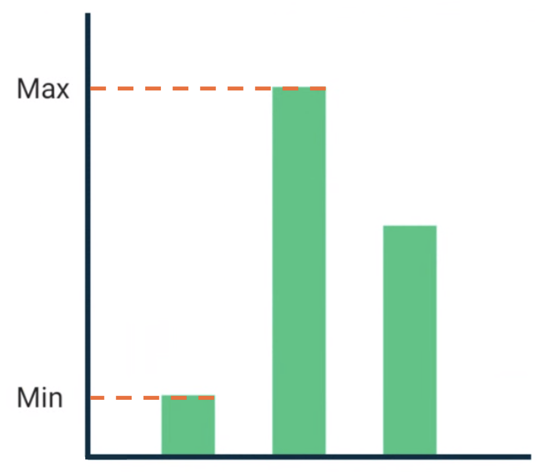
BarChart composable with Text aligned to the maximum and
minimum data value.Custom alignment lines are defined as top level variables in your project.
/** * AlignmentLine defined by the maximum data value in a [BarChart] */ private val MaxChartValue = HorizontalAlignmentLine(merger = { old, new -> min(old, new) }) /** * AlignmentLine defined by the minimum data value in a [BarChart] */ private val MinChartValue = HorizontalAlignmentLine(merger = { old, new -> max(old, new) })
The custom alignment lines to create our example are of type
HorizontalAlignmentLine, as
they're used to align children vertically. A merge policy is passed as a
parameter in case multiple layouts provide a value for these alignment lines. As
the Compose layout system coordinates and the Canvas
coordinates represent [0, 0], the top left corner and the x and y axis are
positive downwards, so the MaxChartValue value will always be smaller than
MinChartValue. Therefore, the merger policy is min for the maximum chart
data value baseline, and max for the minimum chart data value baseline.
When creating a custom Layout or LayoutModifier, specify custom alignment
lines in the MeasureScope.layout method, which takes an
alignmentLines: Map<AlignmentLine, Int> parameter.
@Composable private fun BarChart( dataPoints: List<Int>, modifier: Modifier = Modifier, ) { val maxValue: Float = remember(dataPoints) { dataPoints.maxOrNull()!! * 1.2f } BoxWithConstraints(modifier = modifier) { val density = LocalDensity.current with(density) { // ... // Calculate baselines val maxYBaseline = // ... val minYBaseline = // ... Layout( content = {}, modifier = Modifier.drawBehind { // ... } ) { _, constraints -> with(constraints) { layout( width = if (hasBoundedWidth) maxWidth else minWidth, height = if (hasBoundedHeight) maxHeight else minHeight, // Custom AlignmentLines are set here. These are propagated // to direct and indirect parent composables. alignmentLines = mapOf( MinChartValue to minYBaseline.roundToInt(), MaxChartValue to maxYBaseline.roundToInt() ) ) {} } } } } }
Direct and indirect parents of this composable can consume the alignment
lines. The following composable creates a custom layout that takes as a
parameter two Text slots and data points, and aligns the two texts to the
maximum and minimum chart data values. The preview of this composable is
what's shown in Figure 2.
@Composable private fun BarChartMinMax( dataPoints: List<Int>, maxText: @Composable () -> Unit, minText: @Composable () -> Unit, modifier: Modifier = Modifier, ) { Layout( content = { maxText() minText() // Set a fixed size to make the example easier to follow BarChart(dataPoints, Modifier.size(200.dp)) }, modifier = modifier ) { measurables, constraints -> check(measurables.size == 3) val placeables = measurables.map { it.measure(constraints.copy(minWidth = 0, minHeight = 0)) } val maxTextPlaceable = placeables[0] val minTextPlaceable = placeables[1] val barChartPlaceable = placeables[2] // Obtain the alignment lines from BarChart to position the Text val minValueBaseline = barChartPlaceable[MinChartValue] val maxValueBaseline = barChartPlaceable[MaxChartValue] layout(constraints.maxWidth, constraints.maxHeight) { maxTextPlaceable.placeRelative( x = 0, y = maxValueBaseline - (maxTextPlaceable.height / 2) ) minTextPlaceable.placeRelative( x = 0, y = minValueBaseline - (minTextPlaceable.height / 2) ) barChartPlaceable.placeRelative( x = max(maxTextPlaceable.width, minTextPlaceable.width) + 20, y = 0 ) } } } @Preview @Composable private fun ChartDataPreview() { MaterialTheme { BarChartMinMax( dataPoints = listOf(4, 24, 15), maxText = { Text("Max") }, minText = { Text("Min") }, modifier = Modifier.padding(24.dp) ) } }
Recommended for you
- Note: link text is displayed when JavaScript is off
- Graphics in Compose
- Custom layouts {:#custom-layouts }
- Intrinsic measurements in Compose layouts